Rebranding Sign in and Password reset flow to reduce
customers complaints to 89%
Easypaisa Digital Bank – Sign in
Role Product Designer
Sector Fintech
Case Study Type Product Design
Project Overview:
At Easypaisa, Pakistan’s first and largest digital bank with over 14M active users, we identified a recurring issue: users were unable to reset their passwords independently, leading to a high volume of calls to our helpline. As a product designer, I led the redesign of the password recovery and sign-in flow to empower users with self-service capabilities, reduce support load, and improve overall user experience.
Challenge
Over 80,000 support calls received for the same recurring issue: “My PIN is blocked.”
Self-Service PIN Reset Flow
Create a seamless, intuitive experience that empowers users to reset their PIN without relying on customer support.
Identifying UX Friction
Analyze the current flow to uncover pain points and propose an improved, user-centered solution.
Designing for Low Literacy
Build a flow that’s accessible and easy to understand for users with limited reading ability by local language and guided steps
My Process
User Research & Empathy Mapping
Conducted user research by analyzing support call recordings and Firebase data to identify pain points in the PIN reset flow, with a focus on challenges faced by low-literacy users.
Flow Redesign & Simplification
Redesigned the existing PIN reset journey to reduce cognitive load—introducing guided steps, visuals, and clearer language to support self-service.
Wireframes & Prototypes
Created low- to high-fidelity wireframes and interactive prototypes to test and validate new flows before development.
Accessibility & Inclusivity
Ensured the new design was accessible to users with low literacy or limited tech fluency—using iconography, animations, and voice prompts where needed.
Cross-Functional Collaboration
Worked closely with product managers, developers, and the customer experience team to align design solutions with technical feasibility and business goals.
Usability Testing & Iteration
Conducted usability tests with real users to validate solutions and iterated based on feedback to ensure clarity and ease of use.
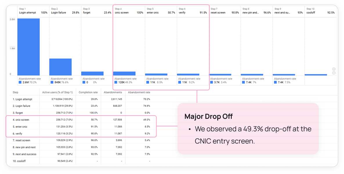
Using Firebase to Uncover User Pain Points
During the early stages of the project, we integrated Firebase to monitor real user behavior and identify friction in the existing flow. By analyzing real-time data—such as user drop-off points, time spent on screens, and incomplete actions—we were able to pinpoint where users were getting stuck. For example, Firebase Analytics revealed a significant drop-off after the verify CNIC step, suggesting confusion or lack of clarity. This data-driven approach gave our team confidence in prioritizing the most impactful design changes.
*The attached Firebase data represents one month of user activity, providing a detailed view of user behavior and issues.
Empathy Mapping through Customer Calls
I combined Firebase analytics and recorded phone call data with empathy mapping workshops to go beyond the metrics. This approach allowed me to step into the users’ shoes and redesign experiences that were not only functional but also emotionally resonant
Says
Expresses confusion about unclear instructions and unclear messaging in the PIN reset process.
Voices frustration when the interface doesn’t indicate progress, attempts made, or wait time.
Mentions that the buttons feel misaligned or hard to tap—especially on smaller devices.
Says they’d rather call support than “waste time trying and failing.”
Think
Wonders whether the reset actually worked or not.
Thinks: “Did I already try three times?” or “Will I be locked out if I do this again?”
Questions why the screen looks different from the usual flow.
Considers abandoning the reset or asking someone else for help.
opportunities
Repeats failed attempts without knowing there’s a limit.
Abandons the self-service flow and contacts the help center when locked out.
Skips reading longer instructions due to limited literacy or language comprehension.
Threats
Frustrated: Feels stuck due to a lack of guidance and unclear feedback from the interface.
Anxious: Fears losing access or being permanently locked out.
Dependent: Doesn’t feel empowered to resolve the issue without help.
Overwhelmed: Struggles to understand the process when instructions aren’t in local language or are too wordy.
Existing flow and problems
Flow Redesign & Simplification
I redesigned the flow to be intuitive and accessible, especially for users with low digital or reading literacy. By using guided steps, visual cues, attempt counters, and local-language prompts, I aimed to reduce confusion and build confidence. To cover all pain points, I mapped multiple user scenarios and edge cases. The simplified flow reduced cognitive load, improved task completion, and lowered dependency on support
I created low-fidelity wireframes to explore simpler user flows and improve visual hierarchy. After iterating based on feedback, I built interactive prototypes to test key actions like PIN entry and retry limits. These helped validate the new flow and guide final refinements.
Ensured the new design was accessible to users with low literacy or limited tech fluency—using iconography, animations, and voice prompts where needed.
Voice Prompts
Add audio cues or voice instructions to guide users through critical steps with clarity.
Regional Language Support
Allow users to switch to local languages for better comprehension among low-literacy audiences
Contextual Animation
Use animated GIFs to visually explain actions and reduce confusion during the PIN reset process.
Contextual Animation
Use animated GIFs to visually explain actions and reduce confusion during the PIN reset process.
Guided Video for Self-Learning
Include a short, easy-to-follow video tutorial within the flow to help users learn how to reset their PIN on their own reducing support dependency.
Turning Wait Time into Play Time
In compliance with State Bank’s security cool-off requirement, we introduced a simple in-app game to keep users engaged during the lockout period.
Turning wait time into a light, entertaining experience.
Usability Testing Insights
Verify if users can easily follow the designed workflow, ensuring that it matches their mental model and expectations.
0%
User Flow Validation
In the usability,h users successfully followed the workflow without major issues.
0%
Navigation Assessment
Users found the navigation elements intuitive and easy to use.
0%
User Satisfactions
Users reported high satisfaction with the wireframes and workflow.
0%
Reset PIN completion rate
0%
Popup language switch completion rate
0%
Find how to video completion rate
Final touches and Figma is Ready for Dev
The Result
The impact was significant. We reduced user complaints from over 80,000 per month to fewer than 100—a massive relief for our customer support center. By addressing a few key UX issues and improving accessibility, we empowered users to resolve PIN problems on their own, leading to a smoother experience and less dependency on support.
What I Learnt
The Easypaisa sign-in journey redesign reinforced the impact of user-centered thinking, thoughtful UX writing, and iterative testing in improving core user flows. By focusing on real user pain points, simplifying the login process, and ensuring clarity at every step, we built a more intuitive and secure experience. This project highlighted how design can directly influence user trust, reduce friction, and support business goals. It was a reminder that great design isn’t just functional—it’s empathetic, strategic, and the result of close collaboration across teams.